Return
to MyCatholicSource.com
Does This Site Display Properly On Your Screen?
If Not, Scroll Down For Possible Fixes...
(or click here)
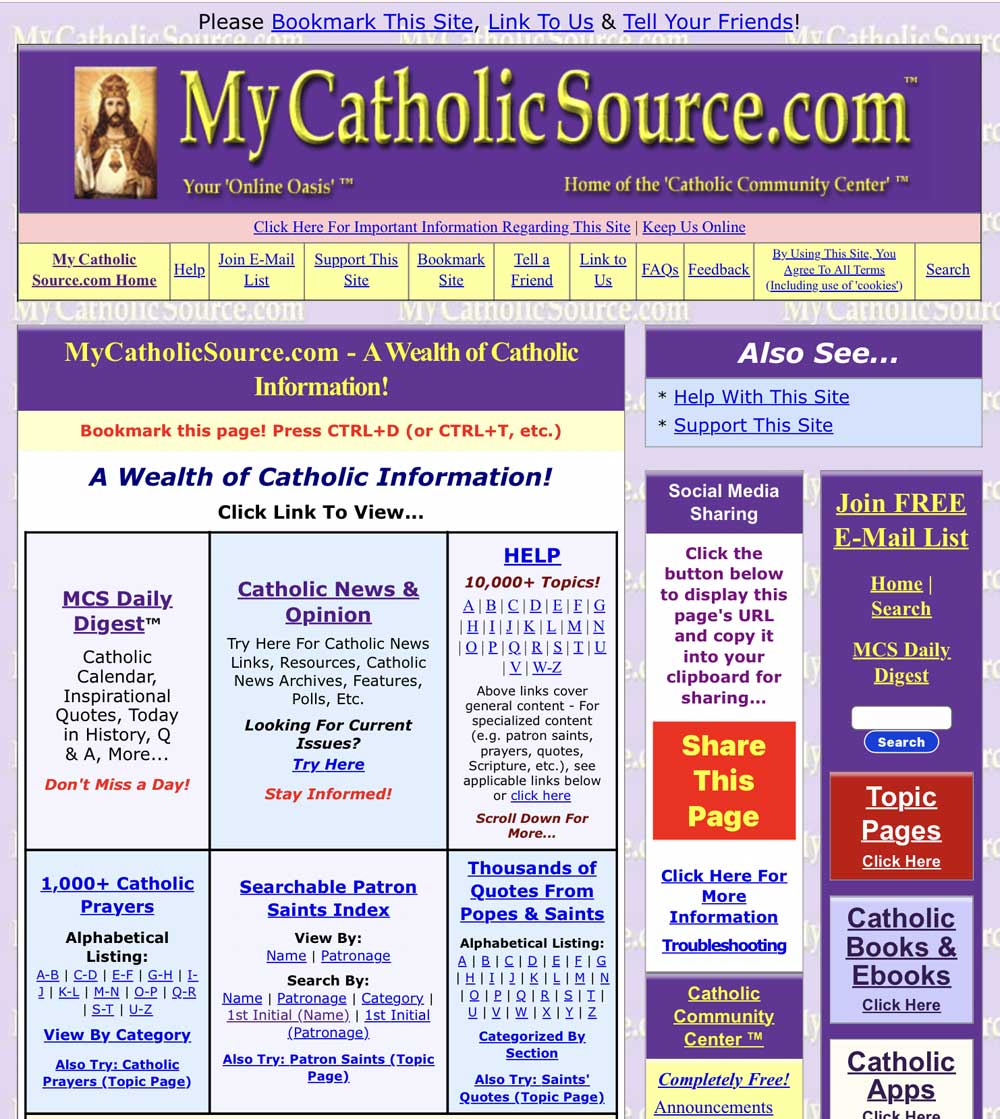
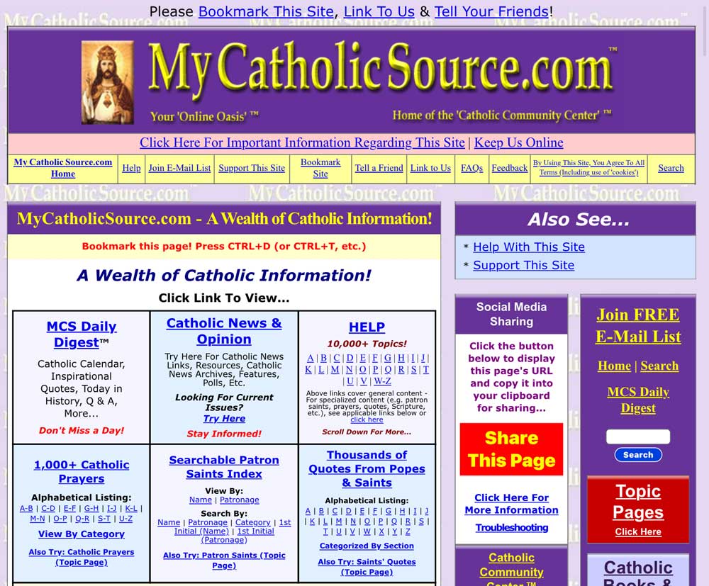
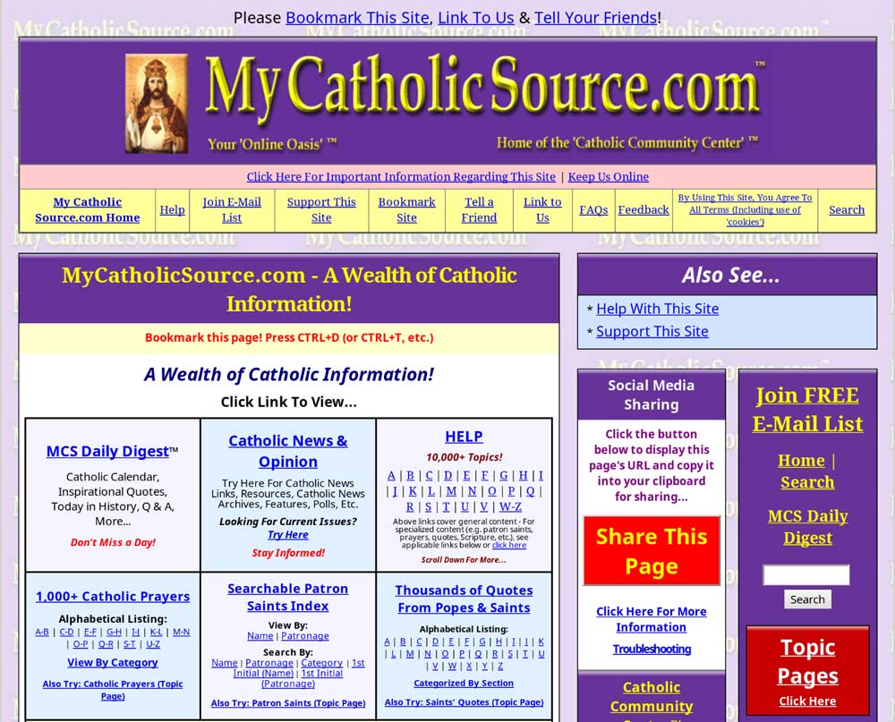
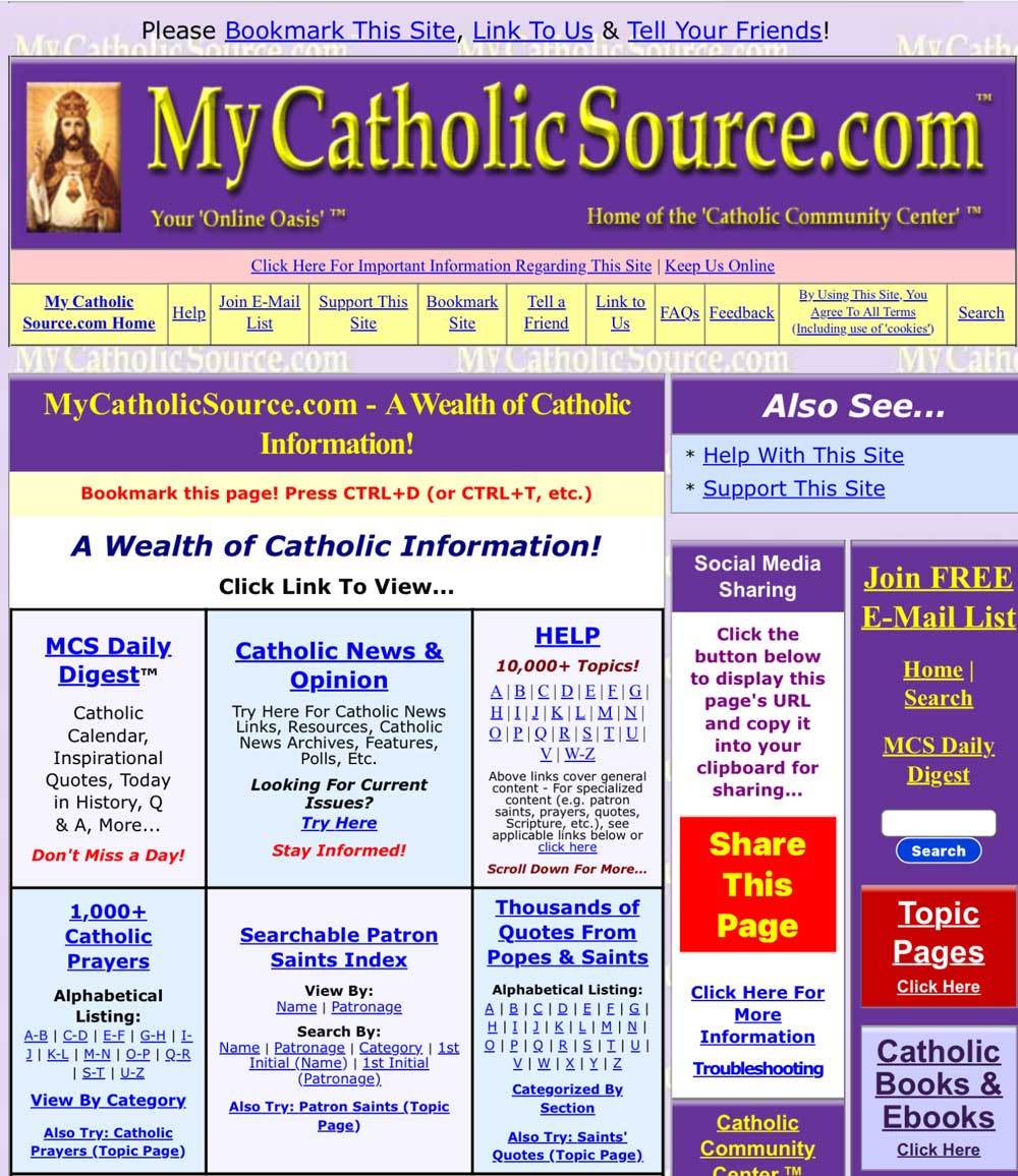
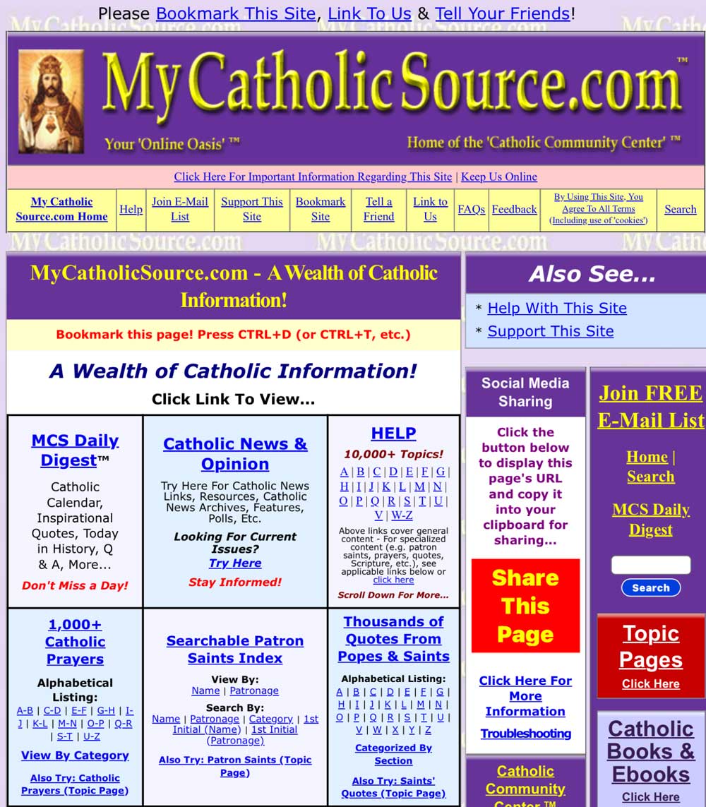
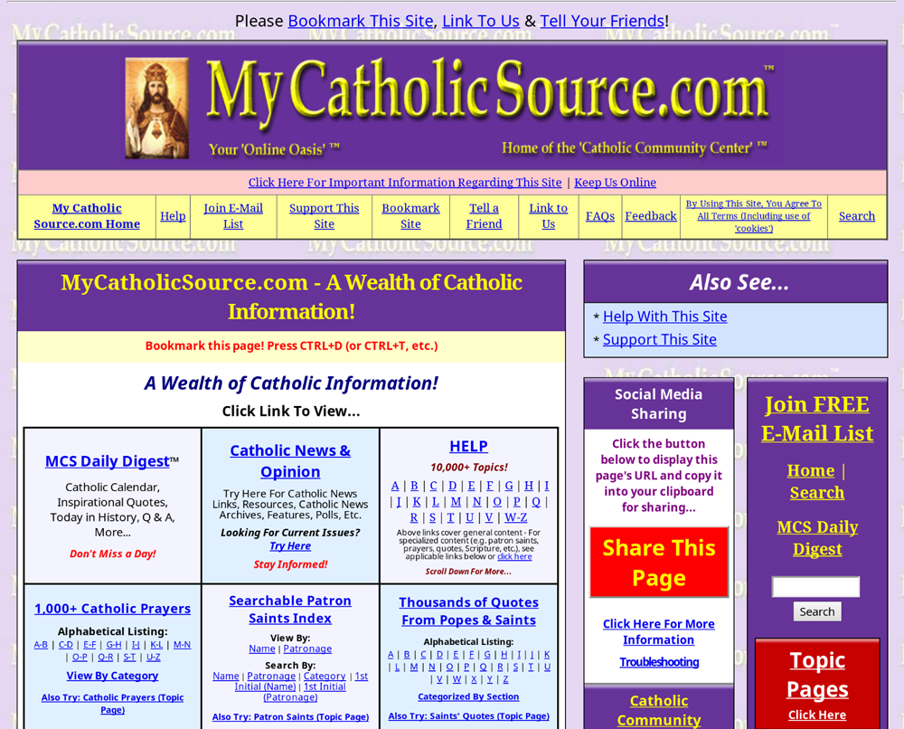
The Spacing Of The Page At
Should Appear Similar
To The Images Below...*

Example 1 (proper spacing at right)

Example 2 (proper spacing at right)
Note: Text distortion due to sizing of image

Example 3 (proper spacing at right)
Note: Text distortion due to sizing of image |
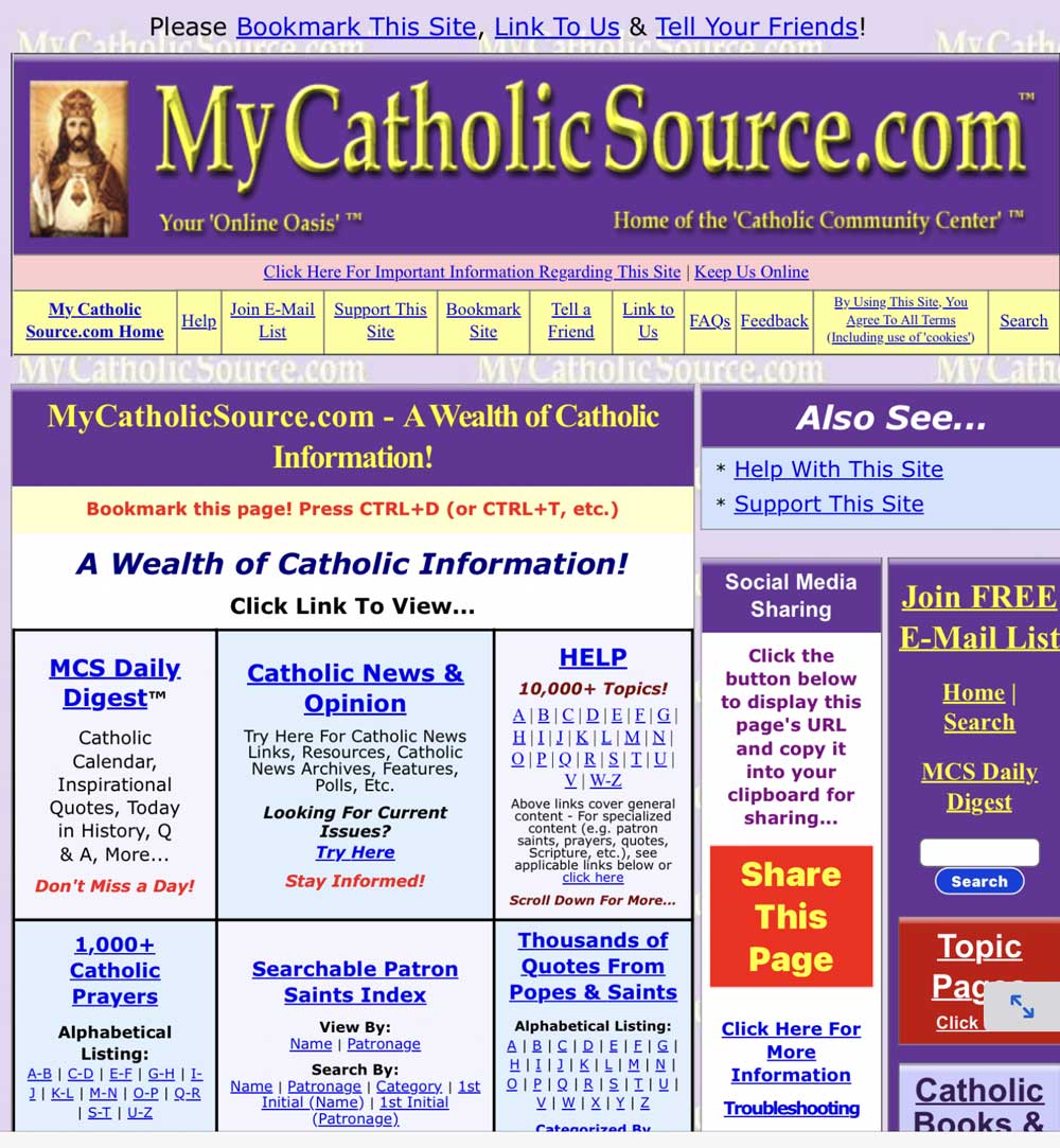
It Should NOT Appear Similar
To
These Images...*
(Note how the columns at right are crowded together and the far
right column is truncated below...)

Example 1 (improper spacing at right)

Example 2 (improper spacing at right)

Example 3 (improper spacing at right) |
* Note: Above images
illustrate spacing of the above referenced page in multiple browsers on a specific date
[cropped &
sized to fit constraints (which may regrettably produce some distortion
–
however, they remain
illustrative concerning spacing at right)]. Note that improper spacing is
not limited to examples above. Also note that page
content/design are subject to change at any time. For possible fixes for
display issues, try below and
also
try here.
|
UPDATE:
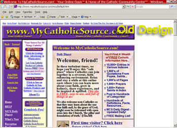
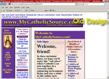
The following refers to our old design. If you encounter display issues with our new
design, please see above (and, if applicable, let us know). Thank you.
SKIP TO FIXES
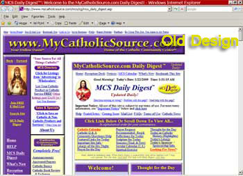
The Home Page
at
Should Appear Similar to the Image Below...

|
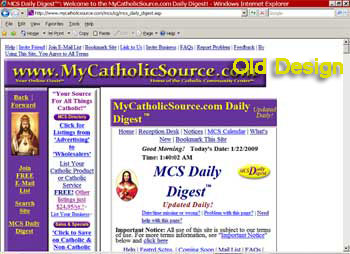
It Should NOT Appear Similar to
This Image...

Note how the top line and other lines wrap and
the text is overly large |
The MCS Daily Digest
at
Should Appear Similar to the Image Below...

|
It Should NOT Appear Similar to
This Image...

Note how the top line and other lines wrap and
the text is overly large |
POSSIBLE FIXES:
- - -
NEW
DESIGN - - -
To Fix, Try The Following, As
Applicable...
* Try in landscape mode +
* Try adjusting zoom settings
You Might
Also Consider...
* Trying another browser (or browser version)
* Trying on another system/device
+ Note: In some cases, flipping hand-held
device to landscape and back to portrait mode may fix spacing issues
For More Possible Fixes, Try
Here
3/4/26:
Some Observations Concerning Display Of MyCatholicSource.com On iOS Mobile Devices...
Although it may be different for each user (and
may change at any time), we have found that the MyCatholicSource website has
looked best in the 'Puffin' browser (although we cannot recommend any browser).
For example, the following is an example of how this site looked in Puffin...

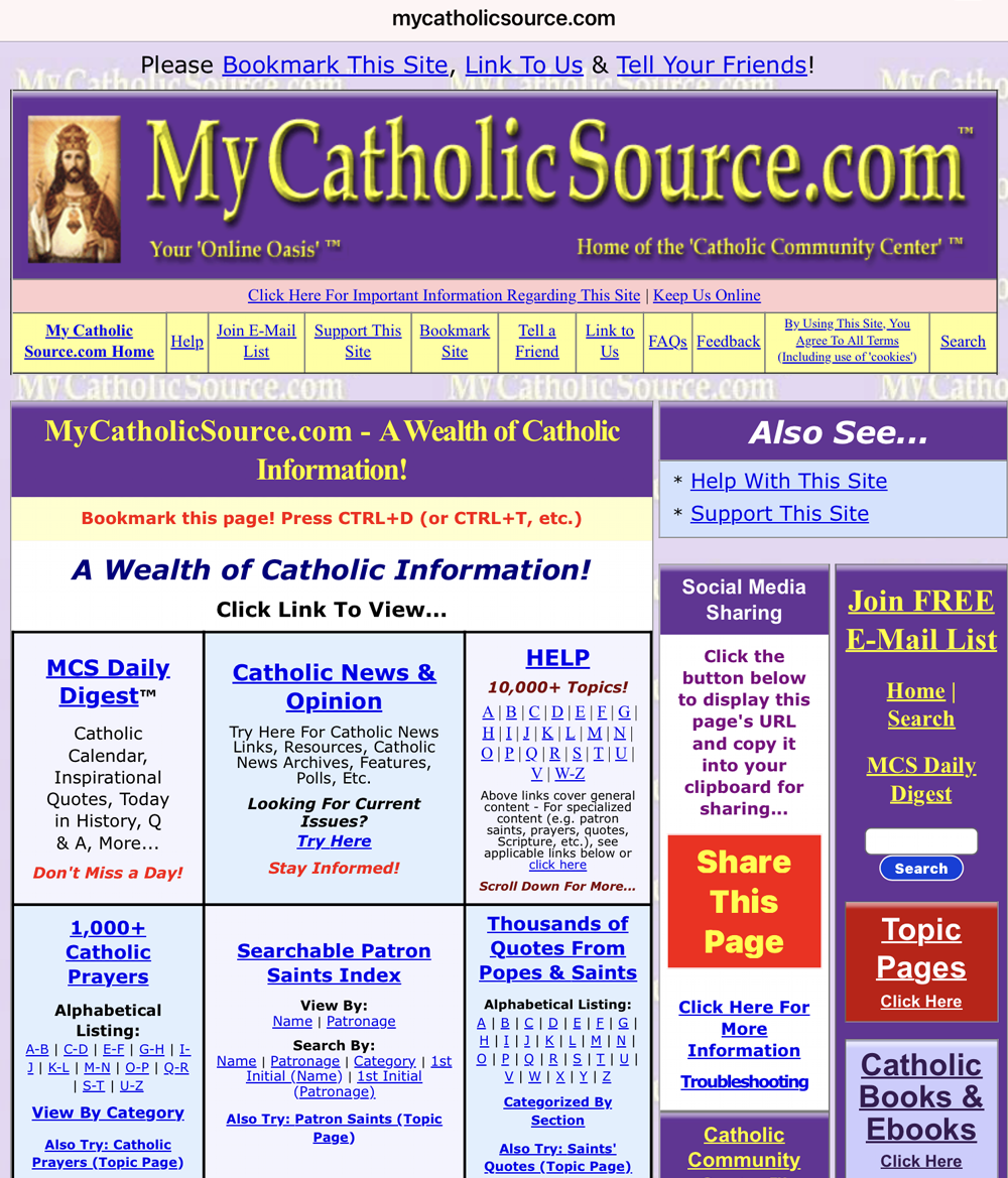
In our testing, the site initially looked a little off in
Safari. See example below (followed by a possible fix)...

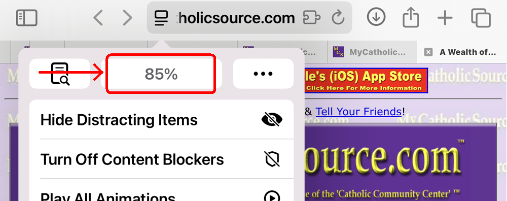
But this was resolved by setting the zoom for the
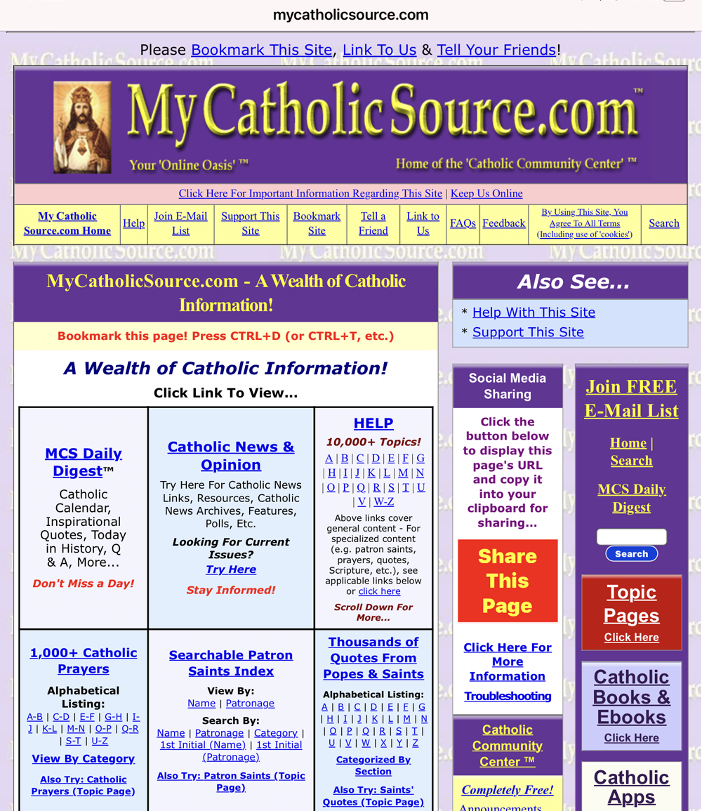
website to 85%...

Which resulted in the following display...

- - - OLD DESIGN - - -
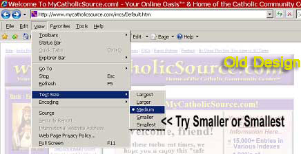
To Fix, Try Adjusting the Text Size
Down in Your Browser. For Example, in Internet Explorer, Select "View", then
"Text Size", then "Smaller" or "Smallest" (see illustration below)

Please Note: If you still have difficulties with the display of this site after
trying the above, please let us
know. With your notification, please let us know if the problem is limited
to certain page(s). Also, please let us know which browser you use and whether
or not you use a widescreen monitor. Thank you.
Thank You for Your Support of MyCatholicSource.com™!
We make no guarantees regarding any item herein. By using this site
you agree to all terms. For more terms information, click
here.
Copyright © 2009-2026, B.F.S. All rights reserved.

